

When it comes to making money with affiliate traffic, where you place your ads can be just as important as what you’re promoting. And that’s where interstitial pages come in — if you know how to use them right.
So let’s dive in:
What is an interstitial page, why does it matter for affiliates, and how do you make sure it doesn’t wreck your user experience (UX)?
🛤 First Things First: What Is an Interstitial Page?
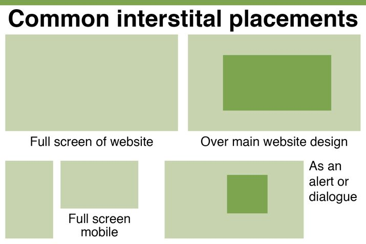
An interstitial page is a full-screen ad that appears between two pieces of content.
Think of it like a pit stop: a user clicks something, and before they land on the next page, an offer is shown — big, bold, and center stage.
Technically, an interstitial web page can pop up:
- Between two articles
- Between an app’s loading screens
- After clicking a button or link
It’s not a random popup — it’s a designed interruption.
And when done right, it can skyrocket conversions without killing the user journey.
🚀 Why Affiliates Should Care About Interstitial Pages
Because if you’re buying push, popunder, or native traffic, you already know: users don’t always convert on the first touch.
An interstitial page can:
- Warm up cold traffic
- Deliver a strong call to action
- Pre-qualify users before hitting the main offer
- Increase time on site and engagement metrics
In fact, smart affiliates are using interstitial page UX optimizations to:
- Reduce bounce rates
- Increase EPC (Earnings Per Click)
- Control user flows more tightly
It’s not just about slapping an ad between pages — it’s about using the interruption strategically.
🧠 Interstitial Page UX: What Makes or Breaks It?
Let’s be real: a bad interstitial kills trust fast.
You don’t want users feeling like they fell into a trap.
Here’s how to build interstitials that actually work:
- Make it fast — If it lags, they bounce.
- Keep it clean — No messy designs or endless scrolls.
- Clear CTA — Tell users exactly what you want them to do.
- Easy exit — Let users skip if they want. A forced journey = a dead journey.
💡 Pro Tip: Mobile-first interstitial webpage design isn’t optional anymore. 70%+ of affiliate traffic is mobile. Design accordingly — big buttons, lightweight assets, no annoying timers.
🔥 Interstitial Page Examples That Crush
Here’s what top affiliates are doing:
- Lead capture interstitials — “Get a free gift! Enter your email.” (works great for sweepstakes and Nutra verticals)
- Prelander quizzes — Short 2-3 question funnels that increase commitment before the main offer.
- Discount popups — “Wait! Here’s 20% off if you act now.” Classic for e-commerce and betting offers.
These are not random “buy now” slaps — they are designed interactions that move users down the funnel.
💡 “Wondering which offers work best with interstitials or push ads? Don’t guess — check out our guide to the top-converting verticals for push traffic and match your creatives to the right niche.”
❌ What NOT to Do with Interstitial Pages
Quick checklist:
- Don’t block content permanently.
- Don’t hide exit buttons.
- Don’t make users click through 5 screens before seeing the offer.
- Don’t autoplay sounds (unless you hate profits).
Google especially penalizes aggressive mobile interstitials — so if you rely on organic traffic alongside paid, keep UX clean.
🎯 Final Thoughts: Are Interstitial Pages Worth It for Affiliates?
If you’re serious about ROI, then yes — interstitial pages are one of the best tools in your affiliate toolbox.
But only if you respect the user’s journey.
A well-placed interstitial web page can turn casual browsers into high-value leads.
A bad one? It’ll just spike your bounce rate and burn your traffic budget.
Remember: It’s not about interrupting users.
It’s about guiding them — and making sure every stop on their journey counts.

")

